Comments have been closed for this post.
Nemesis Design
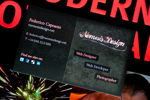
Hello, my name is Federico Capoano,
I enjoy developing cutting-edge websites
and working with creative people.
10 Effective Business Card Design Tips
25th July 2010 in Design Tags: business-card, learnings, list, print, tips
If you don't have experience with the print world you might find out that your business card you just printed might look quite different than what you saw in photoshop (or any other software you use). If you have been smart enough, the print you got is just a proof and now you can make some corrections to your design and send it again for another proof.
But before sending your file again read this post: here I want to share with you some tips I just learnt recently while designing my card.
1. Document Size, Units, Resolution
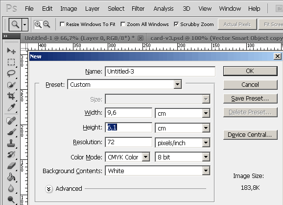
Unless you have a very good reason, stick to the standard business card size. You don't want your business card to not fit in someone's wallet or pocket, do you?
Start a new document 9,6 cm wide and 6,1 cm high - that in pixel is 1134 x 720 and select "CMYK Color" as Colour Mode
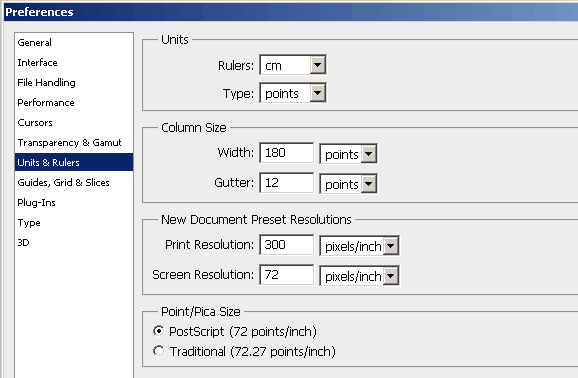
If like me you are using photoshop, go to "Edit > Preferences > Units & Rulers" and change the following:
- Rulers unit to "cm" (centimeters) or "inches" if you are from a country that doesn't use the international metric system;
- Type unit to "points";
- Print Resolution: "300 pixels/Inch"
2. Why CMYK instead of RGB?
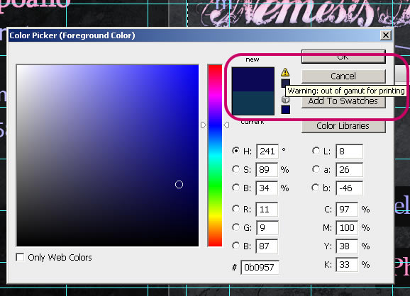
If you are a web designer and you don't know much about the print world you might be used to work in RGB colour mode (I hope at least you know what RGB does mean!).
The way that colors are mixed to produce what we see on a monitor is different than paper:
- monitors use the additive RGB method - that mixes red, green and blue to produce all the other colors;
- while monitors emight light, paper absorbs it, so it cannot use an additive method but a subtractive. This is what it is the CMYK, a subtractive colour method that uses cyan, magenta, yellow and black to subtract red, green and blue from light to produce the other colors;
If you send an RGB file to print it will be converted to CMYK before being printed. The result might look quite disappointing since CMYK as a much restricted colour gamut (that means the available range of colours).
So if you don't want to have surprises work in CMYK and pay attention when you chose a color, photoshop will tell you if it's out of gamut for print, see the image above.
3. Prepare the "Bleed"
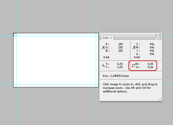
The bleed is an extra part that will be cut out. This is important because introduces a margin of error in the cropping step of the final prints.
Most print shops where I am now (Spain) require a 3 mm bleed, that is 0,3 cm and 35 pixels.
With the "Rectangular Marquee Tool", while holding the shift button, draw a square of 0,30 cm wide and high starting from the top-left corner. Insert two guides that coincide with the marquee edges. Move the square marquee to the bottom right corner and do the same.
Here it is, now you have a bleed! Remember that the part between the guides and the borders will be cut out.
4. Distance from the borders
For a better aesthetic and harmony, keep at least another 0,35 - 0,40 cm from the bleed guides.
5. Text and Logo Size
This is the most important element to care about when designing a business card. You don't want your clients to struggle when trying to read your contact details, do you?
Then, here's a list of tips about text size:
- The minimum size you might use is 6 points, under than that the text will be hard to read;
- Your name should be bigger than the address and contact information, try to increase the size of 1/2 points or try to put the text in bold (and why not try a combination of the two?)
- The company name or logo should be minimum 12 points. If, like mine, you're logo is not available in photoshop to edit its size take my logo size as a reference: about 4 cm wide and 1 cm high
Consider 1 point more if you're using a dark background.
6. Use Fonts Designed for Print
Be sure the fonts you are using are designed for print. At same size, some fonts tend to print smaller compared to others. So be sure to test your design before sending it to print.
7. Testing: Make Proofs
I think all print shops let you do one or two print proofs - for free - before printing hundreds of business cards. Take advantage of this opportunity and make sure you like your proof.
If you want to save time, you can even print it with your office printer before printing a proof at the shop.
8. Increase Saturation
In some cases, from a colour point of view, the final print can look quite dull and disappointing, especially if you converted a file from RGB colour mode.
If your print proof look a bit dull or dark, try to increase the colour saturation a bit. This can be done either by adding an "Hue / Saturation" adjustment layer or, if you want more control, by chosing more saturated color for each element of your design.
On screen it will look a bit too much maybe, but the final print will look much better.
9. Ensure your text is readable
Ensure the text colour has a good contrast with its background colour. If you struggle reading your text try adding a rectangle sized background of a contrasting colour to improve its readability.
10. Keep It Simple
Here it comes a rule that is valid for everything, web-design, programming, and print-design: just Keep It Simple.
Do not over-design your business card. Too much detail might give poor results on paper.
Conclusion: Be Creative and Have Fun
"Rules Are There To Be Broken"
I read a lot of guidelines and rules over the internet about this topic. But not every rule is universal, for example while most people advice to write all your contact information on your business card I didn't write an address or a landline phone number on it. The reason is simple: in the last 2 years I have moved 6 times and switched between Italy and Spain 3 times, if that would happen again what would I do? Throw my business card and print them again? What if someone has still my old business card and decides to call me or come to see me?
Other articles suggest to people that work in two countries to use both languages on a business card, but come on that would look ugly. I work with people from all over europe, what the hell should I do write my card in 3 languages? Italian, Spanish and English? No thanks. Maybe one day I'll print 3 versions instead if needed - but I doubt it.
So to hell all those rules and have fun while designing your card!
Categories
Let's be social
Popular posts
- Django Tagging Autocomplete Tag-It
- Django: FileField with ContentType and File Size Validation
- 10 Effective Business Card Design Tips
- How to setup StaticGenerator with Apache + mod_wsgi
- IE8 doesn't like 1x1px semi-transparent backgrounds
Latest Comments
“ I got very good results with this, thanks for sharing. ”
By Yasir Atabani in How to speed up tests with Django and PostgreSQL
“ Hi Amad, for any question regarding OpenWISP, use one of the support channels: http://openwisp.org/support.html ”
By Federico Capoano in How to install OpenWISP
“ Sir please guid , i have install the ansible-openwisp2 , now how to add the access points . What is the next procedure . Please help. ”
By Ahmad in How to install OpenWISP
“ Hi Ronak, for any question regarding OpenWISP, use one of the support channels: http://openwisp.org/support.html ”
By Federico Capoano in netjsonconfig: convert NetJSON to OpenWRT UCI
“ Hi, I have installed openwisp controller using ansible playbook. Now, i am adding the configurations automatically using OPENWRT devices in openwisp file by specifying shared_key so can you suggest me if I want to set limit to add configuration how can i do it? ”
By Ronak in netjsonconfig: convert NetJSON to OpenWRT UCI
Mondo Print said:
( on 26th of July 2010 at 23:29 )
“Great tips. Thanks for sharing.”
Farooq said:
( on 25th of October 2010 at 06:52 )
“nice article”
Kristina said:
( on 19th of January 2011 at 00:19 )
“This is a very helpful article for reviewing a business card printing design to help make sure it will print to look like the design view. I like how your business card example displayed here matches your website design. This is really helpful for building on or taking advantage of branding and brand recognition.”
Business Card Sizes said:
( on 19th of January 2011 at 11:28 )
“One of the quality article that can be useful for people willing to print business card design for their daily routine life.
Dow Printing at http://www.dowprinting.com offers quality standard business cards for their valued customers.”
Website design said:
( on 3rd of February 2011 at 08:00 )
“Nice tips for the DIY”
creativeideaz said:
( on 24th of May 2011 at 09:19 )
“Nice site with helpful Tips, Techniques and Tools. I have not seen anywhere else thank you and keep up the good work!”
Ken said:
( on 30th of May 2011 at 08:55 )
“Wow great article ! Thanks for sharing.”
Printomatic said:
( on 8th of July 2011 at 09:01 )
“Keep your card updated. No one wants to call a number that doesn't work. If you do this, you will be losing a good number of customers. So as soon as you change number or address, be sure to change the contact details in your business card as well.”
John williams said:
( on 18th of July 2011 at 12:48 )
“Really nice and creative business card design. I would love to see those innovative creations...”
Printing Samples said:
( on 22nd of July 2011 at 10:06 )
“Thanks for the tips. Maybe that is the reason why I always never get what i want, it never reach my desire but it all solve right now.”
Cardbaba said:
( on 25th of July 2011 at 10:48 )
“Great tips...will keep that..
Thank you for sharing”
iDesignow said:
( on 4th of August 2011 at 15:44 )
“Very useful tips, thanks !”
Chetaru said:
( on 3rd of October 2011 at 07:10 )
“Thanks for sharing this information and resources its really help full for me with the help of this we can improve we design.”
Tim said:
( on 13th of October 2011 at 14:13 )
“Very nice and usefull tutorial how to design a business card.”
Chetaru said:
( on 17th of October 2011 at 15:23 )
“Thanks for sharing this information and resources its really help full for me with the help of this we can improve our Design and Development working.”
Michell said:
( on 18th of October 2011 at 09:20 )
“Thank you for sharing this helpful information, it's really help me to make my new business card.”
Erik said:
( on 28th of October 2011 at 10:15 )
“This is very great tips for good business card. Thank you.”
halcion said:
( on 5th of February 2012 at 14:31 )
“I like how your business card example displayed here matches your website design. It's really help me to make my new business card.”
Tami said:
( on 21st of February 2012 at 15:24 )
“Amazing article..very helpful!! thanks”
alltimeprint said:
( on 9th of March 2012 at 11:10 )
“Your collection of business cards very creative and superb. Its nice designing of business cards and your information very knowledgeable for business card printing..”
ryan said:
( on 7th of May 2012 at 05:42 )
“Completely agree about keeping it simple, sometimes people try a little too hard”
Paul said:
( on 26th of July 2012 at 04:22 )
“You are right , business card should be simple. Thank you for posting a nice article for us. Please check a few business cards from my website.”
Thomas Adam said:
( on 3rd of August 2012 at 11:10 )
“Great tips here! Remember to use photo and visual-appealing designs to make it outstanding :)”
Jimmy Martan said:
( on 14th of August 2012 at 10:20 )
“Thanks for this well explaind tutorial!Its been very useful for the newbies...Great job done keep it up!!1”
Teresa @ Stationery Printing said:
( on 17th of August 2012 at 09:36 )
“You have nice insights here. May I just a reminder. Always use quality paper and ink for the printing. No matter how sophisticated a design is, it will look low class if printed on cheap paper. There would be at tendency for the details to blur as well.”
anushri tayal said:
( on 19th of August 2012 at 08:08 )
“Hey I have made a Business Card but at the time of image view I was quite sure for the size of the font used. But when I got it printed then the fonts were so small that we need a microscope for it. The size for Address, contact was 6.5. Please guide me”
Federico Capoano said:
( on 20th of August 2012 at 14:59 )
“Links now have the rel="nofollow" attribute.”
Jeraldine said:
( on 21st of September 2012 at 00:27 )
“Grazie Mille!
Muchas Gracias!”
dude said:
( on 30th of October 2012 at 18:32 )
“simple,short,and not uptight,just the way tips should be!
thank you ♥”
Nelson said:
( on 9th of November 2012 at 08:20 )
“Great tips. I love designing my own business card. Your tips are to the point and I have implemented each of them. I just hope the printer does a good job this time around:) Many Thanks. Cheers !!”
Swoop Print said:
( on 7th of December 2012 at 09:32 )
“Noticed your publish really interesting . I seriously liked reading it and you made really some fantastic aspects. It really helped me. I’ll save this web site for the foreseen future!”
V. Balasundaram said:
( on 7th of January 2013 at 14:44 )
“size = 5cm x 8.5cm, colour = white, letters = blue, for general contracting co. with logo Powerful with shining star”
Business Man said:
( on 3rd of April 2013 at 17:50 )
“great tips for designing business cards! I'll definitely be using some of them in up coming designs. The card at the top of the page looks amazinnng!”
Javi said:
( on 3rd of August 2013 at 18:50 )
“Just wanted to say thanks for the help. Also, I believe there is a type-o on "At same size, some fonts tend to" and another at”
Abhijit said:
( on 17th of August 2013 at 20:15 )
“It’s very useful! Thanks for sharing :)”
paulas said:
( on 30th of October 2013 at 08:07 )
“brilliant thats good,keep on its really encouraging”
svarc said:
( on 18th of March 2014 at 13:40 )
“Thank you for this good tips. It make my work more easy.”