Comments have been closed for this post.
Hello, my name is Federico Capoano,
I enjoy developing cutting-edge websites
and working with creative people.
Nice Skip Links Appearing on :focus with CSS
1st October 2010 in Accessibility Tags: css
Skip links, also known as "Skip Navigation Links", are a good way to improve the accessibility of a website, providing an important shortcut for keyboard users and screen readers to browse the website, without forcing them to tab (or worse read) through the whole page before getting to the content they're interested in.
A classic example of skip navigation link is "Skip to content", pointing to an anchor link placed in the same page which allow the user to skip directly to the main content.
There are many ways to implement skip navigation links, the most common ones require an effort in the initial design phase: the links have actually to be placed somewhere.
Unfortunately, many designers forget to include this element in their design. Some of them do not want to use it for an aesthetic reason, some others simply ignore it. For both cases there is an easy way to fix this!
Using CSS :focus pseudo-class
This method is both helpful for screen readers and keyboard users: screen readers will read the html text, while keyboard users will get a nice big skip link appearing on screen.
Isn't that nice and easy?
You can check it out on this demo page or even on this blog: try to click on the upper left corner of this page, then start tabbing. What do you see?
HTML Code
<!-- logo / name of the site first -->

<ul id="skip">
	<li><a href="#content-anchor">Skip to content</a></li>
	<li><a href="#search-anchor">Skip to search</a></li>
</ul>

<!-- other markup -->

<a name="content-anchor" class="accessibility">Main Content</a>

<!-- main content here -->

<a name="search-anchor" class="accessibility">Search form</a>

<!-- search form here -->
In advice to use a list because this way you can always add a link to it if you think it would be useful. Personally, I think a skip to search link is quite handy.
See "Multiple Skip Links" for more information.
Pay attention though! Being too creative in this context might confuse the user.
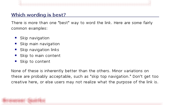
Be sure to stick to the common wording.
CSS Code
.accessibility{
	position: absolute;
	left: -99999px;
	height: 10px;
	width: 10px
}

#skip{
    position: absolute;
	left: 0;
	top: 0;
	width: 100%;
        margin-left: 0;
	text-align: center;
	list-style: outside none;
}

#skip li{ list-style-type: none }

#skip a{
	position: absolute;
	left: -99999px;
	top: 30px;
}

#skip a:focus, #skip a:active{
	position: relative;
	left: 0;
	z-index:9999;
	width: 75%;
	height: auto;
	margin: 0 auto;
	padding: 30px 45px;
	text-align: center;
	text-decoration: none;
	letter-spacing: -4px !important;
	font: bold 50px "Arial", "Freesans", sans-serif !important;
	/* color information, edit this to suit the colors of your layout */
        color: #AEAEFE;
	background: transparent url(transparent.png) repeat scroll 0 0;
	border: 1px dotted #ffb4db;
}
This code hides the <ul> element and styles the skip links so they appear in an obvious way on screen when focusing (tabbing) on them.
Before implementing this method and start to adapt the code to your needs I want to warn you about some important things you should know about skip inks.
Do not use "display: none" or "visibility: hidden"
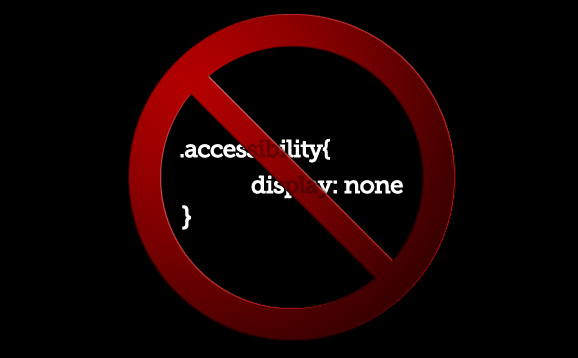
Here's a dumb way to hide content for screen readers, infact most screen readers won't read the text contained in elements set to "display: none" or "visibility: hidden".
This is more than correct, because usually these two directives are used to hide parts of the page that will show up when the user accomplish some interface interaction.
See "The search for the perfect skip link" for more information.
Do not use empty anchor links
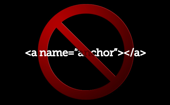
According to accessibility tests, contentless anchor elements are ignored by JAWS (which is one of the most popular screen readers in use) and several other browsers and screen readers. For this reason you should include some text in your content anchor.
You can even put the anchor inside an heading (<h2>) or a <label> in case of the search form.
See "The search for the perfect skip link" for more information.
Place skip links after the logo
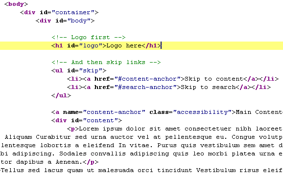
It's important to place the html code of the skip links after the logo:
This way we'll ensure screen reader users will always know without any doubt that they're browsing the same web site and they didn't jump accidentally to another one, especially if the other eventual web site would be implementing the same method placed before the logo!
If something like that would happen a screen reader user would not even know he accidentally jumped on another web site.
Stick to the common wording
As already suggested before in the post, stick to the common wording otherwise users might get confused.
Set :focus styles in your CSS
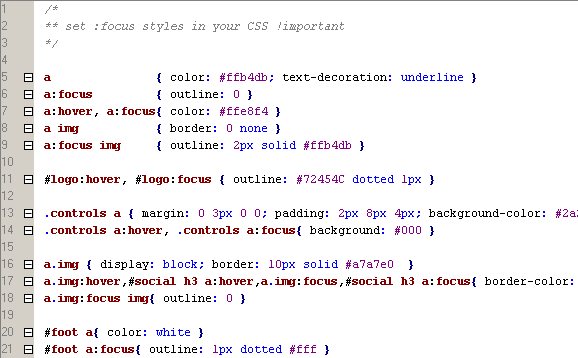
You should style properly the :focus pseudoclass of all your links and forms in a way that keyboard user understand where their focus goes when they press the tab key.
An easy and effective solution for links is to use the same styling for the :hover and :focus pseudo-classes.
Skip Links don't work on all browsers out of the box

Unfortunately there are some issues that are browser related. Watch out!
This article explains it pretty well and provide a working solution:
Skip links: Chrome, Safari and Added WAI-ARIA
Conlcusion
Have you ever assisted an old person in crossing the street? Have you ever taken someone on a wheel chair around the city?
If the answer is yes, then you know how sometimes things that for us are extremely easy might be a difficult obstacle to them.
And if you have been in one of the situation described previously the first thing you probably thought was:
How come who built this didn't think about it?
Did they forget about people with disabilities?
Well if, as me, you had this thought at least once in your life and you make websites for a living, then you surely understand that is our responsibility, as designers, to not make the same error with web sites.
This solution is quick, easy and doesn't involve any effort in thinking about where to place the links in the design, therefore why not implementing it?
Categories
Let's be social
Popular posts
- Django Tagging Autocomplete Tag-It
- Django: FileField with ContentType and File Size Validation
- 10 Effective Business Card Design Tips
- How to setup StaticGenerator with Apache + mod_wsgi
- IE8 doesn't like 1x1px semi-transparent backgrounds
Latest Comments
“ I got very good results with this, thanks for sharing. ”
By Yasir Atabani in How to speed up tests with Django and PostgreSQL
“ Hi Amad, for any question regarding OpenWISP, use one of the support channels: http://openwisp.org/support.html ”
By Federico Capoano in How to install OpenWISP
“ Sir please guid , i have install the ansible-openwisp2 , now how to add the access points . What is the next procedure . Please help. ”
By Ahmad in How to install OpenWISP
“ Hi Ronak, for any question regarding OpenWISP, use one of the support channels: http://openwisp.org/support.html ”
By Federico Capoano in netjsonconfig: convert NetJSON to OpenWRT UCI
“ Hi, I have installed openwisp controller using ansible playbook. Now, i am adding the configurations automatically using OPENWRT devices in openwisp file by specifying shared_key so can you suggest me if I want to set limit to add configuration how can i do it? ”
By Ronak in netjsonconfig: convert NetJSON to OpenWRT UCI


Chris the Developer said:
( on 4th of October 2010 at 16:58 )
“Nice trick, but it creates rendering issues in Chrome 6.0.472.55 on OSX SL...”
Federico Capoano said:
( on 4th of October 2010 at 17:22 )
“Oh, damn OSX! :-)
It works nicely on Chrome for Windows and Linux. I send you an email now so maybe you can answer with a screenshot, ok?”
Beben said:
( on 4th of October 2010 at 20:24 )
“your first demo a pic???”
Dathan said:
( on 5th of October 2010 at 10:38 )
“Really brilliant, thanks for the tip!”
Nawaz KHan said:
( on 5th of October 2010 at 13:48 )
“Few thing I like to mention here
1.) You could reuse the class accessibility for the "skip to Link"
<a class="accessibility skip" href="#content">Skip to main content</a>, then have just the a.skip:active, a.skip:focus class with !important in it,
2.) You could use the href point to ID of the main div or main content div and avoid extra markup like a name=""
3.) You could trigger hasLayout like zoom:1 for the main content DIV and solve the IE issue”
Ade H said:
( on 6th of October 2010 at 03:10 )
“This is good advice and, like you, I really would like to see many more designers follow this and other such practices.
But I would like to add one point about the wording. The annual accessibility survey by Webaim indicated a preference for text that states to where the link points, rather than the content over which it is skipping. For example; "skip to main content" is considered to be preferable to "skip navigation" because the former is less likely to be misread or misheard. The latter might be misread or misheard as "skip to navigation". Users with whom I carry out testing all express this preference and cite this reason for it.
Aside from that, thanks for publishing such a good article.”
Federico Capoano said:
( on 6th of October 2010 at 19:02 )
“@Nawaz Khan
Thanks for your opinion.
I think 1) is just a matter of preference in CSS programming.
2) is a good suggestion, but it could be useful to have the anchor for the sake of explicity.
3) good suggestion, but that goes a bit beyond the purpose of this article, because if I consider the problem in IE I should also offer a solution for the problem of Chrome and Safari
@ Ade H
I think you are right and for this reason in the example code shared here I used "Skip to content" and "Skip to search".”
Federico Capoano said:
( on 8th of October 2010 at 17:03 )
“@ Beben
ops, the link was wrong, I corrected it. Thanks!”
Nimipäivä said:
( on 10th of January 2012 at 21:10 )
“Nice trick, works nicely!”